Supreme Court & District Court Website
Transforming a complex public information ecosystem into a more accessible digital experience
- Timeline
- Ongoing
- Role
- UI/UX Designer & Front-End Developer
- Tools
- Figma, Nuxt.js
- Project Type
- Website Design & Development
Project Summary
The Supreme Court website served as a central public resource for court services, legal information, announcements, forms, and official documents. Over the years, the platform had expanded significantly, resulting in increasingly complex navigation, fragmented information structures, and inconsistent user experiences across devices.
The goal of the redesign was not only to modernize the visual experience, but more importantly, to improve how users discover, understand, and navigate large volumes of court-related information.
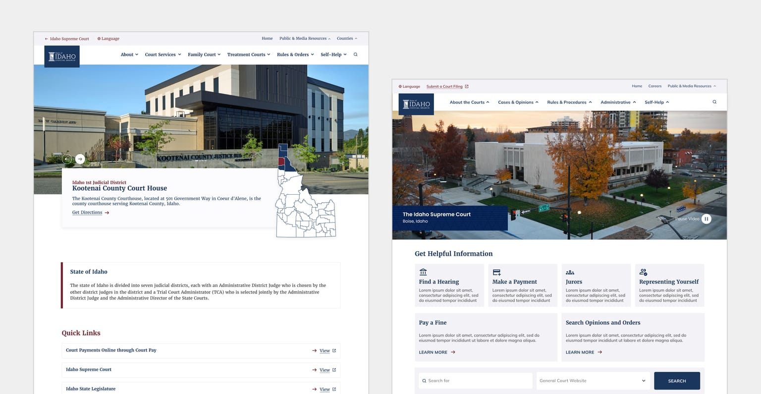
In addition to redesigning the Supreme Court website, I was also responsible for designing the District Court websites that existed within the same ecosystem while helping maintain consistency across the broader platform experience.
This project focused heavily on:
Information architecture
Navigation restructuring
Content discoverability
Responsive usability
Accessibility-minded design
Scalable front-end implementation
Rather than designing purely for aesthetics, the outcome aimed to create a more intentional experience for the different types of users interacting with the platform.
The Problem
The existing website had evolved over many years without a unified UX strategy, resulting in a platform that felt difficult to navigate and overwhelming for users unfamiliar with court systems.
Navigation Complexity
The navigation structure had become increasingly difficult to use due to:
Crowded menu systems
Overlapping categories
Inconsistent hierarchy
Too many competing entry points
Difficult-to-find resources
Users often needed to navigate through several pages before locating important information or documents.
Content Discovery Challenges
Court websites naturally contain large amounts of content intended for a wide range of audiences, including:
Legal professionals
Government employees
Citizens
First-time visitors
Users unfamiliar with legal terminology
One of the biggest usability concerns was helping users quickly locate:
Documents
Court information
Forms
Contacts
Services
Court-related resources
The redesign aimed to simplify how users searched, browsed, and understood information throughout the ecosystem.
Outdated Experience
The existing experience also reflected older design standards and was not fully optimized across modern devices, leading to inconsistencies between desktop and mobile experiences.
Constraints
This project involved several real-world constraints that significantly influenced design decisions.
Content-Heavy Environment
Because the platform contained large amounts of text-based information, the design needed to prioritize readability, clarity, and structure over heavy visual styling.
I intentionally avoided overly graphic-heavy layouts and instead focused on creating interfaces that helped users process information more efficiently.
The challenge was finding the right balance between:
Visual modernization
Content clarity
Accessibility
Usability
Frequent Content Changes
Court-related information changes frequently, requiring the website to remain flexible and maintainable over time.
To support this, I designed reusable and scalable components that could easily adapt to content updates without requiring major redesign efforts.
This was especially important because revision timelines and implementation windows were often limited.
The goal was to ensure that:
Future updates remained efficient
Components stayed consistent
Design revisions were not cumbersome
The system could scale across multiple court websites
Balancing Consistency and Flexibility
Since the project included both Supreme Court and District Court websites, I needed to create a system that felt unified while still allowing each site to maintain its own structure and identity.
Process & Approach
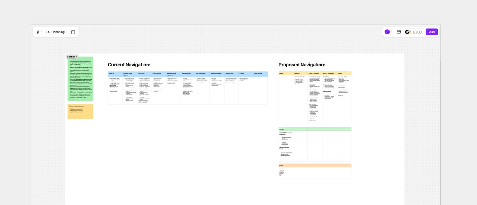
Website Audit & Analysis
Before proposing solutions, I conducted a comprehensive review of the existing experience.
I analyzed:
Navigation structures
Content organization
User pathways
Existing page hierarchy
Searchability of information
Mobile responsiveness
Common usability pain points
This helped identify where users were likely experiencing friction and confusion.
Information Architecture Strategy
One of the most significant parts of the project was restructuring how information was organized.
Rather than immediately redesigning pages visually, I focused first on improving the underlying structure of the platform.
Key objectives included:
Simplifying navigation
Reducing cognitive load
Improving discoverability
Creating clearer content relationships
Supporting both expert and non-expert users
The goal was to design information around how users naturally search for resources rather than how the organization internally categorized them.
Wireframes & User Flows
Because navigation restructuring represented a major shift from the existing experience, wireframes became an important communication and validation tool.
Wireframes helped:
Explore structural concepts quickly
Compare navigation approaches
Validate user journeys
Align stakeholders around proposed changes
Key flows focused on:
Document discovery
Court resource navigation
Public information access
Search experiences
Iterative Design & Prototyping
The project involved multiple rounds of iteration and refinement.
Interactive prototypes were used to evaluate:
Navigation hierarchy
Page layouts
Information prioritization
Responsive behavior
Content presentation
This iterative process allowed the experience to evolve while balancing user needs, technical constraints, and stakeholder feedback.
Responsive Design
The redesigned experience was built to support:
Desktop
Tablet
Mobile devices
Special attention was given to maintaining readability, navigation clarity, and accessibility regardless of screen size.
Front-End Development
In addition to design responsibilities, I also implemented front-end pages using Nuxt.js.
This included:
Translating designs into production-ready interfaces
Building responsive layouts
Maintaining consistency across pages
Supporting reusable implementation patterns
Working across both design and development allowed me to ensure the final implementation closely aligned with the intended user experience.
Design Improvements
Improved Navigation Structure
The redesigned navigation introduced a clearer hierarchy that made it easier for users to understand where information existed within the platform.
Content was reorganized into more meaningful categories, reducing the effort required to locate resources.
Better Content Organization
Pages and resources were grouped more intentionally based on user needs and content relationships.
This helped improve:
Information discoverability
Scanability
Overall usability
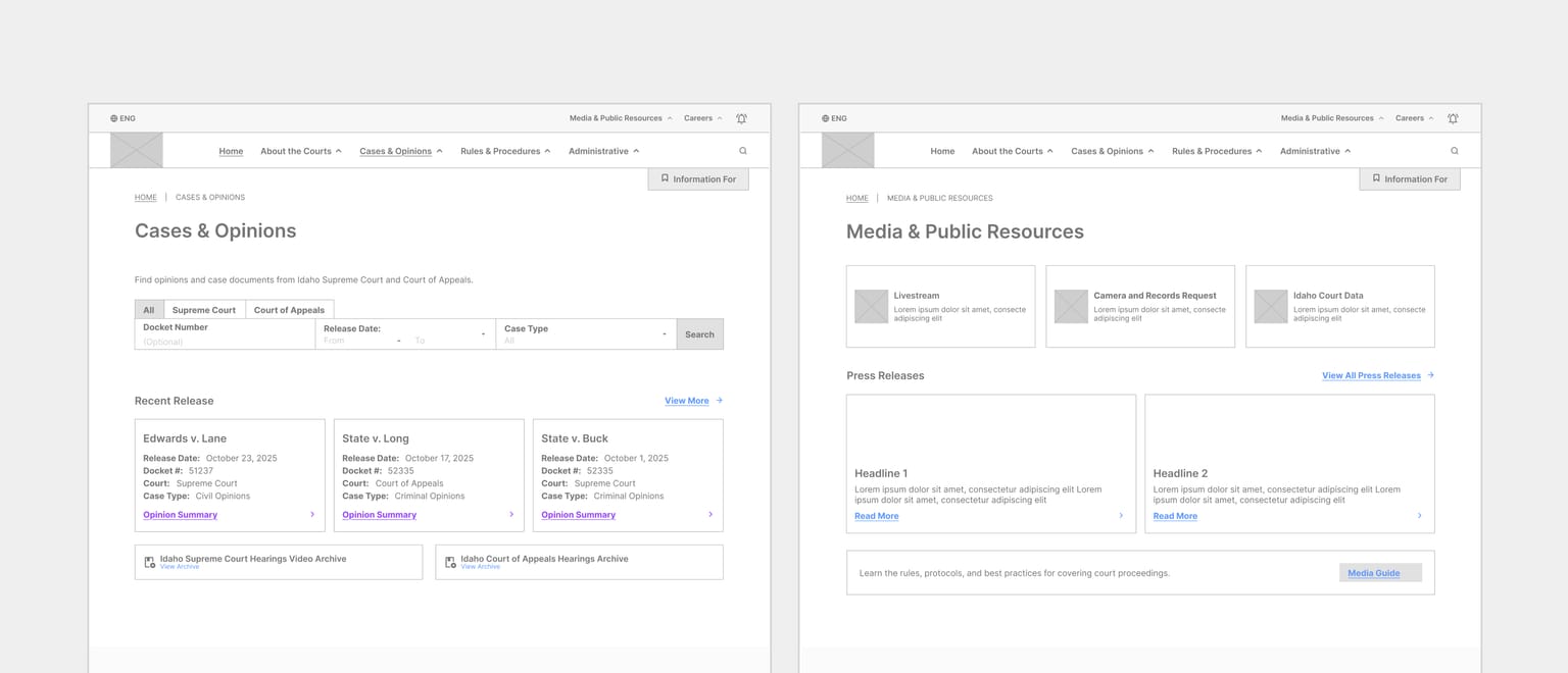
Enhanced Search Experience
One of the most impactful improvements was enhancing how users locate important documents, people, and court-related information.
The redesign addressed previous usability concerns around search and discovery, making critical resources easier to access without excessive navigation.
More Accessible Experience
Legal terminology and court systems can feel intimidating for many users.
Where appropriate, content structures and interface labels were designed to feel more approachable and easier to understand for non-legal audiences.
The goal was to create a platform that felt accessible and welcoming to a broader range of users.
Challenges & Tradeoffs
One of the biggest challenges was designing within a highly content-driven environment while avoiding interfaces that felt visually overwhelming.
Instead of relying heavily on graphics or decorative elements, I focused on:
Information clarity
Layout structure
Typography hierarchy
Navigation simplicity
Content readability
Another important tradeoff involved balancing scalability with customization.
The design system needed to remain flexible enough to support future updates and multiple court websites while still maintaining a cohesive ecosystem experience.
I also had to consider development efficiency by designing reusable components that minimized implementation overhead and simplified future revisions.
My Contributions
Led the redesign of the Supreme Court website
Designed the District Court website ecosystem
Conducted UX audits and usability analysis
Restructured information architecture
Redesigned navigation systems and user flows
Created wireframes and prototypes
Designed responsive experiences across devices
Improved document and information discoverability
Enhanced search experiences
Developed front-end pages using Nuxt.js
Created reusable and scalable UI patterns
Outcomes
Although formal metrics cannot be publicly shared, the redesign successfully addressed several long-standing usability concerns across the platform.
Key improvements included:
Simplified navigation
Improved information organization
Easier discovery of important documents and resources
Clearer user pathways
Better accessibility for non-legal audiences
More consistent responsive experiences
Improved search and browsing workflows
The outcome was not simply a more modern-looking website, but a more intentional experience designed around the needs of different user groups interacting with court-related information.
Reflection & Learnings
This project reinforced the importance of designing for clarity, accessibility, and usability within complex information ecosystems.
Unlike many consumer-facing products, court websites serve users with very different levels of expertise and familiarity with legal systems. Designing for this audience required a strong focus on predictability, comprehension, and confidence.
One of the biggest lessons from this project was understanding how impactful information architecture can be on the overall user experience.
Improving how information is structured and discovered often creates more value than visual redesign alone.
The project also strengthened my ability to:
Design scalable systems
Balance stakeholder and technical constraints
Maintain consistency across large website ecosystems
Build reusable patterns that support long-term maintainability
Most importantly, it reinforced that successful UX is not always about creating something visually bold. Sometimes the best solution is one that feels calm, intuitive, and effortless to navigate.
Conclusion
This project demonstrates my ability to lead large-scale UX initiatives that extend beyond interface design into information architecture, navigation strategy, content organization, responsive usability, and front-end implementation.
By redesigning both the Supreme Court and District Court websites, I helped transform a complex public information platform into a more accessible and user-centered experience while maintaining the clarity and reliability expected from government services.
Ongoing Involvement
I am currently continuing work within the District Court website ecosystem.
One ongoing challenge is maintaining a cohesive experience that still feels connected to the Supreme Court platform while allowing individual District Court websites to support their own unique content structures and operational needs.
This ongoing involvement continues to strengthen the scalability of the overall design system and reinforces the importance of consistency across large digital ecosystems.